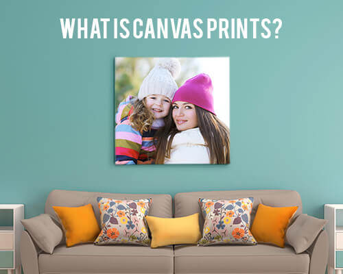
Canvas Collage Ideas for Mixing Photos and Art

Listen to Content
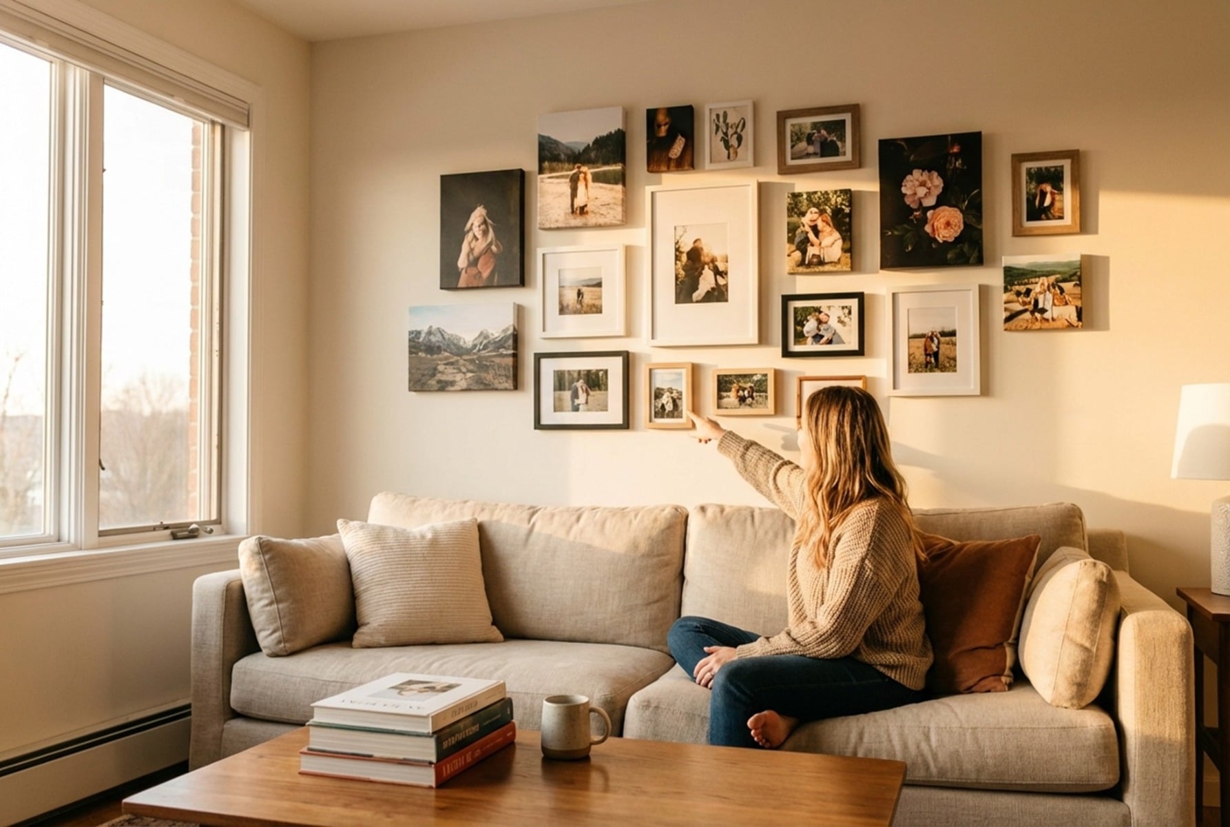
A single canvas print captures a moment, but a collage tells a story. The most compelling wall displays blend personal photographs with artistic elements, creating pieces that feel both intimate and visually sophisticated. Whether you're working with vacation snapshots, family portraits, or abstract digital art, the key lies in understanding how different visual elements interact on a shared surface.
Canvas collage ideas for mixing photos and art have evolved beyond simple grid arrangements. Today's most striking pieces layer textures, play with scale, and weave typography through imagery in ways that transform ordinary photos into gallery-worthy compositions. The approach you choose depends on your space, your aesthetic preferences, and the emotional tone you want to convey. A child's birthday photos might call for playful geometric shapes and bright color blocks, while wedding images might demand elegant overlapping layers with subtle artistic accents. What matters most is creating visual harmony between elements that weren't originally designed to coexist.
Core Principles of Blending Photography and Fine Art
Creating a cohesive canvas collage requires understanding how different visual elements compete for attention. When photographs meet artistic elements, the eye needs guidance on where to look and how to move through the composition.
Balancing Visual Weight Between Media
Photographs carry inherent visual weight based on their content, contrast, and color saturation. A high-contrast black-and-white portrait commands more attention than a soft watercolor texture. When combining these elements, place heavier images near the center or lower portions of your canvas, with lighter artistic elements floating toward edges and upper areas. This creates natural stability without feeling static.
Consider the rule of thirds when positioning your primary photo. Surround it with complementary art pieces that echo its dominant tones without overpowering the subject. A beach photo might pair with abstract wave patterns or sandy textures that extend the image's atmosphere beyond its borders.
Establishing a Unified Color Palette
Pull three to five colors directly from your primary photograph and use these as the foundation for any artistic elements you add. If your family photo features navy sweaters and autumn leaves, your abstract accents should incorporate those same blues and oranges. Color-picking tools in most design software make this process straightforward.
Avoid introducing colors that don't appear somewhere in your photos. Even small splashes of unrelated hues create visual discord that makes the final piece feel disjointed rather than intentional.
Choosing a Central Narrative Theme
Every successful collage tells a story, even if that story is simply "summer at the lake" or "our first year together." Define your theme before selecting images, then choose only photos and art elements that support that narrative. A travel collage might incorporate vintage map textures and handwritten coordinates. A baby's first year collection could weave in soft watercolor florals and milestone typography.
Creative Layout Styles for Canvas Collages
The arrangement of your elements affects the emotional impact as much as the images themselves. Different layouts suit different purposes and spaces.
The Structured Grid for Modern Clarity
Clean lines and equal spacing create a contemporary feel that works particularly well in minimalist spaces. Divide your canvas into equal rectangles or squares, assigning each cell to either a photograph or an artistic element. The key is maintaining consistent margins between cells, typically 0.25-0.5 inches for physical layouts or 10-20 pixels for digital designs.
Alternate between photos and art in a checkerboard pattern, or cluster photos in the center with artistic frames around the perimeter. Both approaches create visual rhythm while keeping the overall composition organized.
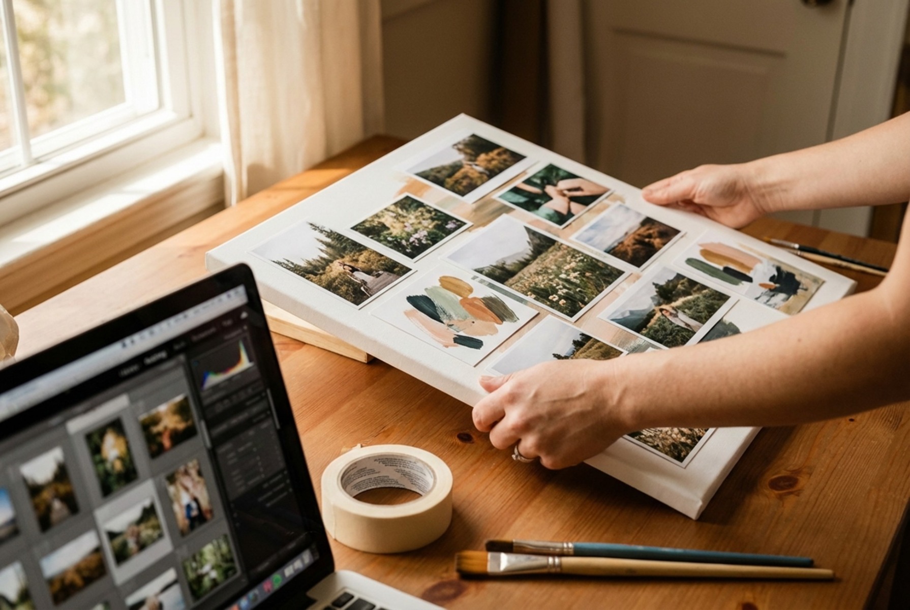
Overlapping Layers for a Mixed Media Look
Layered compositions feel more organic and artistic than rigid grids. Start with your largest photo as the base layer, then position smaller images and art elements so they partially cover each other's edges. This technique mimics the look of physical scrapbooking and works beautifully for nostalgic or romantic themes.
Vary the rotation of overlapping elements by 2–5 degrees to avoid a too-perfect appearance. Add drop shadows between layers to create depth and separation.
The Geometric Mosaic Approach
Hexagons, triangles, and irregular polygons offer a striking alternative to rectangular layouts. Cut your photos into geometric shapes and arrange them puzzle-style, filling gaps with solid colors or patterned art. This approach transforms ordinary snapshots into modern art pieces that command attention.
Techniques for Integrating Digital Art and Personal Photos
Digital tools open possibilities that weren't available to traditional collage artists. The blend of real photography and digital manipulation creates unique pieces.
Applying Artistic Filters to Real Images
Transform selected photos into watercolor, oil painting, or sketch styles while leaving others untouched. This contrast between photorealistic and artistic versions of similar subjects creates visual interest. Convert a landscape photo to a painterly style and place it behind a sharp portrait from the same location.
Using Typography as a Visual Bridge
Words and letters serve as connective tissue between disparate images. Overlay meaningful quotes, dates, or names across the seams where photos meet. Choose fonts that complement your theme: script for romantic pieces, bold sans-serif for modern compositions, vintage typewriter faces for nostalgic collections.
Position text so it spans multiple photos, literally connecting them while adding another layer of meaning.
Incorporating Abstract Textures and Scans
Scan physical materials like fabric swatches, pressed flowers, or handwritten letters to add authentic texture. These scanned elements bring tactile quality to digital compositions. Layer them at reduced opacity over photos or use them as background elements that peek through gaps in your layout.
Physical Customization and Finishing Touches
The final presentation elevates your digital design into a physical art piece worth displaying.
Adding Hand-Painted Accents to Prints
Once your canvas arrives, consider adding physical embellishments. Acrylic paint highlights, gold leaf accents, or textured gel medium create dimension that photography alone cannot achieve. These touches make your piece truly one-of-a-kind.
Test any additions on a sample canvas first. Some paints interact poorly with printed surfaces, and the last thing you want is to damage a finished piece.
Selecting Frame Edges and Wrap Styles
Gallery wraps extend your image around the canvas edges, eliminating the need for frames while creating a floating effect on the wall. Mirrored wraps reflect edge pixels for a seamless continuation of the image, while stretched wraps extend the image itself around the sides. Black or white borders offer a traditional framed appearance without additional hardware.
Practical Tips for Printing and Displaying Your Masterpiece
Resolution matters more for collages than single images because you're working with multiple source files. Ensure every photo measures at least 300 DPI at your intended print size for best quality; 150 DPI is acceptable only for very large prints viewed from a distance. Upscaled low-resolution images become painfully obvious when printed large.
Request proof before committing to large orders. Screen colors rarely match print output exactly, and a small test print reveals issues before they become expensive mistakes. Consider your lighting conditions when choosing between matte and glossy finishes, as glossy surfaces reflect overhead lights and windows.
CanvasChamp offers extensive customization options for bringing your collage designs to life, from various wrap styles to multiple size options that fit any wall space.
Frequently Asked Questions
What resolution should my photos be for a large canvas collage?
Aim for at least 300 DPI at your final print size for optimal clarity. For a 24x36 inch canvas, each photo used should be at least 7200 pixels on its longest edge to avoid visible pixelation.
Can I mix black-and-white photos with color images in one collage?
Yes, but do so intentionally. Either convert all photos to black-and-white for cohesion, or use color strategically to draw attention to specific images while letting others fade into supporting roles.
How many photos work best in a single canvas collage?
Three to seven photos typically create the most balanced compositions. Fewer feels sparse, while more risks visual clutter. Odd numbers generally work better than even for aesthetic balance.
What's the best way to hang a large canvas collage?
Use two hooks spaced apart rather than a single center hook for canvases wider than 24 inches. This distributes weight evenly and prevents tilting over time.
Bring Your Vision to Life
The best canvas collages balance personal meaning with artistic intention. Start with images that matter to you, apply these principles thoughtfully, and don't be afraid to experiment with layouts before committing to print. CanvasChamp makes it easy to transform your designs into stunning wall art with their competitive pricing guarantee and extensive customization options. Explore their canvas printing options to see your photo and art combinations come to life.